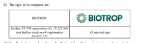
Famiglia di marchi (a fini del giudizio di confondibilità)

App. Milano 3057 / 2’023 del 30.10.2023, rg 2355/2021.rel. Cortelloni, Sergio Ricci spa c. Sergio Rossi spa:

<<La Corte rileva che una “famiglia di marchi”, per essere tale, presuppone un “marchio capostipite” e altri marchi che riproducono lo stesso nucleo fondamentale, identificativo ed evocativo di determinati prodotti, con eventuali mere varianti grafiche, che, peraltro, devono apparire accessorie e marginali rispetto al nucleo fondamentale considerato.
Nel caso in esame, i segni di Stefano Ricci spa oggetto di disamina, come detto, sono i seguenti: …

Orbene, con riferimento a tali segni, sembra a questa Corte che la possibilità di ravvisare in essi un “nucleo fondamentale comune” incontri un forte ostacolo nel fatto che l’utilizzo delle lettere “SR” avviene – in ciascuno dei marchi considerati – con modalità del tutto particolari e differenti: talvolta, mediante l’impiego di forme “classicheggianti” (1); altre, con l’ulteriore inserimento di una cornice geometrica e decorata, a forma ottagonale, dentro la quale le lettere sono inserite su sfondo bianco (2); ancora, mediante l’utilizzo di decori intrecciati tali da rendere meno riconoscibili ed evidenti le lettere e da evidenziare maggiormente l’aspetto decorativo (3); in un altro caso, mediante l’utilizzo delle lettere con modalità non intrecciate e distanti fra loro, in “stampatello” maiuscolo e aventi fondo bianco /sfumato (4); infine, utilizzando forme moderne e quasi geometriche ove, ancora una volta, il richiamo alle lettere “SR” appare molto meno evidente e riconoscibile (5).
Pertanto, in assenza di un “nucleo fondamentale comune” – che non si ripete in modo costante ed evidente – non sembra possibile ravvisarsi, in concreto, l’esistenza di una “famiglia di marchi”, nel senso auspicato da parte appellante>>

Marchio denominativo anticipato da marchio complesso

Trib. ue 13.09.2023, T-167/22, Transformers Manufacturing Company Pty Ltd c. EUIPO – H&F srl, decide la tra i seguenti segni (prodotti quasi uguali):

segno denominativo TMC TRANSFORMERS , chiesto in registrazione;

marchio anteriore azionato dall’opponente

Il Trib conferma le decisioni amministrative che danno ragione all’opponente: il secondo marchio crea confondibilità.

Centrale è l’espressione TMc in entrambi, la quale a sua volta è sufficientemente distintiva.

C’è somiglianza fonetica e visiva, non concettuale

La confondibilità dei marchi nel caso Jagermeister

Il secondo non è vero che sia dissimilar  dal primo: è similar,  anche se solo in parte.

Si noti l’evidente tentatico del secondo di porre una netta differenza nel nome, la cui rilevanza è duplicemente notevole all’interno di ciascun marchio: sia perchè il nome prevale sul disegno nella percezione cnsumeristica (lo stesso BoA lo ricorda) sia perchè è scritto assai ingrande nel caso specifico.

Quindi il rigetto dell’opposizione era ingiustificato e la procedura torna alla Opposition Division per vedere se ciò basta per un giudizio di confondibilità (essenzialmente data la rinomanza dell’anteriorità: <<It must be borne in mind, in particular, that, depending on the degree of recognition of the earlier trade mark, even a low degree of similarity between the signs may be sufficientfor the assumption of a link within the meaning of Article 8(5) EUTMR>>, § 25)

Così il 1 Board of appeal dell’ EUipo 20 giuigno 2023In Case R 1952/2022-1Mast-Jägermeister SE c. Tin Kakuszi (ungheria) (v pag. web euipo  e accouint del fascicolo nel database ove trovi trad. automat. dall’ioriginale tedesco)

<<18. The earlier figurative mark likewise consists of a rectangular shape which resembles a-bottle label. On a dark-green background there is a white rectangle bordered by a green line followed by a white line. There is a horizontal banderolein orange in the middle of the Zei chens, which contains the text ‘Jägermeister’ in black stylised letters. Underneath it is the word element ‘SELECTED 56 BOTANICALS’ in considerably smaller lettering together with further details, which are barely legible on account of their even smaller font. Above the orange stripred is a white and golden green circle which is decorated with golden-coloured leaves on its underside. The stylised head of a stag with antlers in a jet-circle is depicted in the green circle. Above and framed by the anchor is a circle in a lighter green with a white Latin cross. For the above reasons, the most distinctive element of the earlier sign is the word element ‘Jägermeister’. Nevertheless, the brown targeted will not-neglect the graphic design as a whole and in particular the representation of a stag’s head on a green circle with a cross and the green and orange colour schema in the overall impression of the earlier trade mark.
19. Despite the differences that exist, in particular the differences in the most distinctive word components ‘ST. Joseph’ and ‘Jägermeister’ and in terms of the figurative elements (head of a man in contrast to the head of a deer), the opposing signs have a low degree of visual similarity, as theirgraphic arrangement is very similar overall. The signs are identical in terms of their colour schema (green, white, gold and orange/red), their basic rectangular shape, their construction and their essential graphic elements and their arrangement to one another (circular green element with a portraitsimilar strip above an orange-coloured/red banderole).
20. Both the earlier sign and the central left-hand part of the sign applied for consist of an inner (dark) white rectangle which is firstly bordered by a green, then a dark-green white line and then a dark green line. Both signs contain a red or orange band positioned in the centre with a black lettering above which a dark-and-white and golden green circle with a gold floral decoration is attached. In the dark green circle, there is in each case a stylised front view of a head (by a man in the contested sign and a stag in the earlier sign), which is surrounded by a jet circle in each case.
21. The signs under comparison therefore have a low degree of visual similarity.
22. The signs are aurally dissimilar, as the most distinctive word elements ‘ST. Joseph’ of the contested sign and ‘Jägermeister’ of the earlier sign un are pronounced differently-depending onthe different relevant languages.
23. The signs are conceptually dissimilar. Some of the consumers will understand the word element ‘ST. Joseph’ of the contested sign as a reference to the naked Josef. The word-element ‘Jägermeister’ of the earlier sign as a whole has no meaning. Nevertheless, the German-speaking consumer in any case immediately recognises therein thefact that the terms ‘Jäger’ and ‘Meister’ are combined, and therefore a meaning that differs from ‘ST. Joseph’. Furthermore, for all the consumers targeted, the signs differ in the meaning of the respective figurative elements, namely the depiction of a head of a man in the application, in contrast to the depiction of a head of a deer in the earlier trade mark.
24. Overall, the signs under comparison therefore have a low degree of similarity.
25. The Opposition Division considered the signs to be dissimilar and therefore, from their point of view, did not examine the further requirements ofthe asserted opposition. However, since, as stated above, the signs have a low degree of visual similarity, this must be remedied. It must be borne in mind, in particular, that, depending on the degree of recognition of the earlier trade mark, even a low degree of similarity between the signs may be sufficientfor the assumption of a link within the meaning of Article 8(5) EUTMR (-16/01/2018, 398/16, COFFEE ROCKS (fig.)/STARBUCKS COFFEE (fig.) et al., EU:T:2018:4, § 78)>>.

La componente denominativa prevale su quella grafica del marchio: conferma del trend

Trib. UE 6 settembre 2023 , T-576/22, Bora creation slk c. EUIPO-Truie Skincare:

Marchio posterioore: denouinativo TRUE SKIN

Marchio anteriore:

Classe 3: make up e simili

Rifl soggettivO: consumatore spagnolo.

Il trib. conerma che non c’è rischio di confuisione

<<69 A global assessment of the likelihood of confusion implies some interdependence between the factors taken into account and, in particular, between the similarity of the trade marks and that of the goods or services covered. Accordingly, a low degree of similarity between those goods or services may be offset by a high degree of similarity between the marks, and vice versa (judgments of 29 September 1998, Canon, C‑39/97, EU:C:1998:442, paragraph 17, and of 14 December 2006, VENADO with frame and others, T‑81/03, T‑82/03 and T‑103/03, EU:T:2006:397, paragraph 74).

70 In the present case, the Board of Appeal concluded that, in the light of the identity of the goods at issue, the average degree of inherent distinctiveness of the earlier mark, the below-average degree of visual similarity and the average degree of phonetic similarity of the signs at issue as well as the finding that the conceptual comparison remained neutral or that there were no relevant conceptual differences that could help to distinguish between the signs at issue, there was a likelihood of confusion on the part of the Spanish-speaking public which did not understand English, the level of attention of which was average.

71 In that regard, first, the applicant submits that the earlier mark is not essentially perceived as the word mark ‘true’, but that it is the figurative representation of that mark which makes it distinctive because, if that were not the case, that mark could not have been registered on account of the descriptiveness of the term ‘true’ for the English-speaking public. However, it must be pointed out that that argument is similar to that set out in paragraph 46 above and must therefore, for the reasons already stated in that paragraph, be rejected.

72 Secondly, as regards the conceptual comparison, which the Board of Appeal incorrectly found to be neutral, whereas the signs at issue are conceptually different, it must be held that that error of assessment does not have any consequences in the context of the analysis of the likelihood of confusion. As the Board of Appeal pointed out and as the Court has held in paragraph 67 above, the concept is conveyed by one of the two word elements in the mark applied for, namely the element ‘skin’, which is understood as referring to the skin and which is, at best, weakly distinctive with regard to the goods at issue, with the result that the conceptual dissimilarity cannot counteract the overall similarity between the signs at issue.

73 Consequently, in spite of the error of assessment which was made as regards the conceptual comparison of the signs at issue and although there are certain differences between those signs, it must be held that, following a global assessment, the Board of Appeal was right in finding that there was a likelihood of confusion, within the meaning of Article 8(1)(b) of Regulation 2017/1001, on the part of the relevant public>>.

Domanda di contraffazione di marchio rigettata nonostante l’uguaglianza del marchio usato nel keyword advertising

la us distr. court East. dist. of Kentucky-Lexingtom del 24 agosto 2023, Case: 5:23-cv-00232-DCR, Nursing CE Central c. Colibri , rigetta (al momento) la domanda della prima nonostante la seconda avesse usato il marchio denominativo “Nursing CE Central” della prima nel Google advertising e nonostante un rapporto di piena concorrenza (servizi di formazione e consulenza per infermiere).

Ma i consueti sei fattori per la confondibiità portano la corte a rigettare la domanda, nonsotante l’ulteriore elemento del public interest giocasse a favore dell’attore.

(segnalazione e link dal blog del prof. Eric Goldman)

Decisione amministartiva sulla confondibilità dei marchi Abercrombie v. Adenauer e Jaguar v. Puma (sulla confondibilità di segni avversari simili/uguali ma rovesciati)

– I –

La divisione di opposizione dell’EUIPO decide l’opposizione N° B 3 172 678 in data  8 agosto 2023  (qui la pagina del fascicolo e qui link diretto al testo) relativa al confronto tra marchi figurativi.

(segnalazione di Marcel Pemsel su IPKat)

anteriorità 1
anteriorità 2
marchio contestato

L’opposizione è parzialmnente (sotto il profilo merceologico) accolta.

<< e) Global assessment, other arguments and conclusion
Likelihood of confusion must be appreciated globally, taking into account all the factors relevant to the circumstances of the case; this appreciation depends on numerous elements and, in particular, on the degree of recognition of the mark on the market, the association that the public might make between the two marks and the degree of similarity between the signs and the goods/services (11/11/1997, C-251/95, Sabèl, EU:C:1997:528, § 22).
A likelihood of confusion (including a likelihood of association) exists if there is a risk that the public might believe that the goods/services in question, under the assumption that they bear the marks in question, come from the same undertaking or, as the case may be, from economically linked undertakings.
The Opposition Division has assumed in section d) of this decision that the earlier marks have been extensively used and enjoy an enhanced scope of protection. The examination of likelihood of confusion will, therefore, proceed on the premise that the earlier marks have an enhanced degree of distinctiveness. Indeed, the more distinctive the earlier mark, the greater will be the likelihood of confusion, and, therefore, marks with a highly distinctive character because of the recognition they possess on the market, enjoy broader protection than marks with a less distinctive character (29/09/1998, C-39/97, Canon, EU:C:1998:442, § 18).
The goods and services are assumed to be identical or similar to a high degree and they target the general and professional publics. The degree of attention varies from average to high.
The similarities between the signs arise from the depiction of a bird in all the signs, which leads to a low degree of visual similarity and at least an average degree of conceptual similarity (if not identity), while the signs are aurally not comparable, as concluded above. However, the signs differ considerably in the particular ways the common elements are depicted, such as their orientations and different shapes of wings, different circular and/or semi-circular shapes and, in particular, the additional verbal elements of the contested sign, which have no counterparts in the earlier marks. The aforesaid differences are particularly relevant when assessing the likelihood of confusion and all these differences will lead to a rather distinct overall impression created by the signs. Even though both parties have used the same concept of a silhouette of a bird in their signs, this itself is not sufficient to give rise to a likelihood of confusion or association, since the differentiating elements are clearly perceivable and sufficiently outweigh the similarities of a depiction of a figurative bird.
The opponent cannot rely on the protection of the depiction of a type of animal, or its part, per se. In the case of two purely figurative signs (or, by analogy a purely figurative sign versus a figurative sign containing a figurative component, as in the present case), which depict a certain type of animal, or a part of it, the owner of an earlier mark can only preclude registration of a contested sign if the figurative depiction itself shows significant similarities to the latter sign (18/04/2018, R 1547/2017-2, DEVICE OF A BLACK BIRD (fig.) / RABE et al., § 35; 28/05/2009, R 1841/2007-1, Form eines Mammuts / ELEPHANT WORLD-TOURS et al., (fig.), § 56). However, the similarities of the figurative elements in the present case are not considered significant, while important differences between the signs are introduced by the verbal elements of the contested sign, as mentioned above, which have the strongest impact in that sign.
Consequently, in the Opposition Division’s point of view, even if there is a conceptual link between the signs, on account of the coinciding concept conveyed by the figurative element of a silhouette of a bird, the considerable visual differences between the signs, as described above, are sufficient to prevent any likelihood of confusion, especially bearing in mind that the relevant public displays an average to high level of attention. Consequently, the fact that the signs contain a depiction of a silhouette of a bird is not sufficient in itself to lead to a finding of likelihood of confusion. The Opposition Division considers that the consumers will be able to safely distinguish between the signs.
Considering all the above, there is no likelihood of confusion on the part of the public. Therefore, the opposition must be rejected insofar as it is based on Article 8(1)(b) EUTMR.
The opponent has also based its opposition on the following earlier trade mark:
international trade mark registration designating the European Union No 1 457 089 (figurative mark).
This earlier mark invoked by the opponent is less similar to the contested mark. This is because it contains additional figurative components, namely a circle and some figurative lines, which overall give an impression of a simplified depiction of the Sun. These additional elements further differentiate between the signs visually and they also introduce an additional differing concept, which is not present in the earlier trade marks compared above. Therefore, the outcome cannot be different with respect to the goods for which the opposition has already been rejected; no likelihood of confusion exists with respect to those goods>>.

C’è pure un interessante esame dell’opposizione basata sulla rinomanza, p. 10 ss , anche essa accolta parzialmente.

Si sta diffondendo la prassi di cercare di sfruttare la notorietà altrui rovesciando la direzione di un’immagine rinomata (e qui pure aggiungendovi un nome): tentativo per ora rischioso .

– II –

In pari data 8 agosto la stessa Divisione di Opposizione nella OPPOSITION Nо B 3 123 557  Jaguar Land Rover Limited v.Puma Energy International SA  ha dato esito quasi opposto (o semplicemente diverso) al conflitto tra questi due segni per prodotti uguali:

marchio anteriore di Jaguar

e

marchio posteriore di Puma

Le differenze però sono qui maggiori:  spt. direi nel primo il felino sta saltando, mentre nel secondo sta correndo e poi i colori sono invertiti.

<<In making the visual comparison of two marks depicting an animal, the Opposition Division must take care not to apportion excessive weight to a coincidence in features that are merely generic to this part of the animal body (e.g. legs, tails), since these traits, which are common to felines, differ significantly in the details of the marks under comparison (13/07/2017, R 110/2017 2, DEVICE OF A FLYING BIRD (fig.) / DEVICE OF A FLYING BIRD (fig.) et al., § 61; 29/07/2020, R 2901/2019 5, DEVICE OF A SHEEP (fig.) / DEVICE OF A RAM (fig.), § 30). Indeed, these two depictions of a feline show some significant differences. This is caused predominantly by the fact that the depiction of a feline in the contested sign is very simplified and the morphologic features of felines are not clearly, immediately and effortlessly visible. Instead, that sign consists merely of a feline’s contour and requires some mental effort in order to recognise and identify a feline. This contrasts sharply with the depiction of a feline in the earlier mark, which is less streamlined and more detailed/elaborate, and contains more clearly identifiable morphologic features of a feline than the contested sign, such as details of its head, ears, eyes, etc.

In this regard, consumers are capable of perceiving differences between the stylisation of signs. The key point is how the signs at issue are normally perceived overall and not how the stylistic differences between them may be perceived in the event that a particularly meticulous consumer is in a position to examine the graphic stylisation and draw comparisons between them (20/07/2017, T 521/15, D (fig.) / D (fig.) et al., EU:T:2017:536, § 49)>>

La risposta è di dubbia esattezza: il consumatore ricorda ad un livello di astrattezza maggiore , almeno per i beni di largo consumo

(anche qui segnalazione di Marcel Pemsel su IPKat che correttamente solleva il problema del grado di astratezza con cui ricorda il consumatore)

Modifiche al codice di proprietà industriale

la legge 102 del 24.07.2023 (GU 184 del 8 agosto 2023) apporta alcune modifiche al c.p.i.

Le più importati sono nei primi tre articoli: art. 1 Divieto di registrazione di marchi evocativi di indicazioni geografiche e denominazioni di origine protetta;  art. 2 Protezione temporanea dei disegni e dei modelli nelle fiere;  art. 3 Titolarita’ delle invenzioni realizzate nell’ambito di universita’ ed enti di ricerca.

In particolare andrà approfondito il caso sub 1, dovendolo distinguere sia da quello delle segg. lettere c) e c-bis) sia dalla tutela delle denominazioni ex reg. 1151/2012, spt. art. 13 (del cui § 3 potrebbe essere ritenuta attuazione)

Cuiriso è la nuolva disciplina del calcolo dei termini di durata, art. 20: pare non coincuidere con quella civilprocessuale , ad es. , se si tiene conto della’rt. 155 cpc.

il Trib. UE sulla confondibilità tra marchi denominativi (messaggio concettuale dei nomi di persona e neutralizzazione -mancata, nel caso sub iudice- prodotta dagli elementi differenzianti)

Precisazioni sempre utili in argomento da Trib. UE 21.06.2023, Cases T‑197/22 and T‑198/22, Ioulia and Irene Tseti Pharmaceutical Laboratories SA v. EUIPO (+ Arbora & Ausonia, SL).

marchio1 chiesto in registrazione
marchio 2 chiesto in registrazione

Il Trib. per lo più accoglie l’opposizione (cioè non in toto).

Sentenza istruttiva che ripercorre tutti i soliti passaggi nelle liti di questo tipo.

(notizia da M. Pemsel in IPKat)

Lite in tema di marchi per keyword advertising tra studi legali dell’Arizona

Distr. Court of Arizona 8 maggio 2023, Case 2:21-cv-01540-DG, Lerner & Rowe PC,
v. Brown Engstrand & Shely LLC, et al.:

<<The three relevant screenshots produced by Plaintiff show clear labeling of Defendants’ entry, using Defendants’ name and prominently labelled as an “Ad,” and with no use of Plaintiff’s trademark or confusingly similar language or content.

Reasonably savvy Internet users with a strong incentive to select the right lawyer would not be confused by these clearly labeled ads into believing that Defendants were Plaintiff.

Plaintiff produces no survey evidence showing a likelihood of confusion, and its evidence that, at most, 0.215% of all consumers exposed to Defendants’ ads were in fact confused by them is simply not enough to show a likelihood. Two-tenths of one percent is not an appreciable or significant portion of consumers exposed to Defendants’ keyword-generated ads. Plaintiff does have a strong mark, but no reasonable jury viewing Plaintiff’s thin evidence could find that potential clients viewing Defendants’ clearly labeled ads are likely to be confused into thinking Defendants were in fact Plaintiff.
The 25 irrelevant screenshots produced by Plaintiff – screenshots taken during a time when Defendants’ were not buying Plaintiff’s name as a keyword – reinforce the Court’s conclusion. Each of the irrelevant screenshots was produced by searching for “lerner & rowe,” “lerner rowe,” or a variation of these words. Doc. 68-3.

And even though Defendants had not purchased Plaintiff’s name as a keyword, Defendants’ ads appeared in the search results along with ads for other personal injury law firms.

Google’s algorithm apparently called up similar law firms when a specific law firm was searched for. See, e.g., Doc. 57-6 at 15 (including an ad for azinjuredworker.com), 17 (getlawyersnow.com and palumbowolfe.com), 18 (arjashahlaw.com), 20 (getlawyersnow.com), 22 (hutzler law.com), 28 (larryhparkerphoenix.com). These screenshots show what Internet users find when searching on Google for Lerner & Rowe – ads for a variety of law firms.

As with all searches on Google, the consumer then must scroll through the returns to decide which entries are worth clicking on.

Because Defendants’ entries use their name and are clearly labeled “Ad,” the consumers would know they are seeing an ad for another law firm, as would be true with the other firms seen in the screenshots. The Internet user would then, as the Ninth Circuit has recognized, “skip from site to site, ready to hit the back button whenever they’re not satisfied with a site’s contents.” Toyota Motor Sales, 610 F.3d at 1179. This is not confusion; this is typical Internet searching. And because “the owner of the mark must demonstrate likely confusion, not mere diversion,” Plaintiff has presented insufficient evidence to survive summary judgment. Network Automation, 638 F.3d at 1149>>, P. 19-20.

(notizia e link alla sentenza dal blog del prof. Eric Goldman)

Confondibilità tra marchi figurativi

Marchio chiesto in registrazione (per elettronica e gaming digitale):

Anteriorità opposta (per prodotti parzialment simili):

Il Tribunale UE 19.04.2023, T-491/22, Zitro International Sàrl c. EUIPO-a-gaming s.r.o., conferma l’appello amministrativo nel senso che non c’è confondibilità

In particolare non c’è somiglianza visuale, §§ 40 ss.

<< 45  In the present case, it must be stated that the signs at issue share certain features, that is, a central element which includes, inter alia, an open smiling mouth showing teeth, large eyes, a top hat, two arms wearing gloves and two legs wearing shoes. In addition, they are represented in the same colours – white, grey and black.

46 Nevertheless, it must be stated, similarly to EUIPO, that the features mentioned in paragraph 45 above are represented differently in each of the signs. The central element of the sign applied for is an anthropomorphic sphere, while that of the earlier mark is an ovoid. Moreover, aside from the open mouth, the features of the central element of each of the signs are not the same. While the sign applied for contains two wide-open eyes and eyebrows, the earlier sign has a single eye and does not have visible eyebrows. The hats situated over the central elements of the signs at issue are also distinct. Whereas the hat in the sign applied for is of average size, tipped to the left and contains an uppercase ‘b’, the hat in the earlier sign is large, tipped to the right, contains an ‘s’ or dollar sign and some banknotes. Differences can also be established in the position of the arms and proportion of the legs in relation to the central element of each of the signs at issue. Although the sign applied for is represented with straight arms and shorter legs in relation to the central element, the earlier sign is made up of one bent arm and another arm resting on a cane, and legs of the same length as the central element.

47 In the light of those assessments, the Court finds that the overall impression produced by the signs at issue is so different that the relevant public will not establish a link between those signs on the ground that they share certain features and the same colours. They are two fantasy figures stylised differently, that is, on the one hand, a happy figure in the shape of a ball with wide-open eyes, straight arms and short legs and, on the other hand, a figure in the shape of a one-eyed, slightly deformed face with one bent arm and another arm resting on a cane, and legs of the same length as the central element.

48 Contrary to the applicant’s claim, in paragraphs 15 and 16 of the contested decision, the Board of Appeal only described the signs at issue before carrying out a visual, phonetic and conceptual comparison of the signs. The visual comparison of those signs was carried out in paragraph 17 of that decision, in which the Board of Appeal specified that that the signs at issue shared a central part resembling an imaginary face with two legs, two arms and a hat, but that the overall impression given by those signs was very different. Consequently, the applicant’s arguments relating to the fact that paragraphs 15 and 16 of the contested decision take account of certain features or details of the signs at issue must be rejected.

49 The same applies to the applicant’s argument that the Board of Appeal found that the overall impression given by the signs at issue was very different, although it had specified that those signs shared their most relevant aspects, which drew the attention of the relevant public. In that connection, it is sufficient to note that, as is apparent from paragraph 17 of the contested decision, the Board of Appeal merely observed that, despite the fact that the signs at issue shared certain features, their overall impression was very different. Accordingly, the Board of Appeal did not in any way find that the signs at issue shared the most relevant aspects which drew the attention of the relevant public.

50 Regarding the applicant’s argument that, in essence, the features shared by the signs at issue concern the central element and are the most relevant elements, creating a first impression of the signs at issue without engaging in an analysis of their details, and that those signs are represented in the same colours, it must be observed that, as is apparent from paragraphs 46 and 47 above, those features are represented differently, thereby creating a different overall impression given by the signs at issue. Accordingly, even if the consumer does not memorise details, he or she will be able to identify the differences between the signs and, to that extent, will not establish a link between the marks at issue.

51 Regarding the applicant’s argument that the Board of Appeal failed to take account of the arguments in paragraphs 14 to 19 of the application, directed against the decision of the Opposition Division, it should be borne in mind that the Board of Appeal cannot be required to provide an account that follows exhaustively and one by one all the lines of reasoning articulated by the parties before it; the reasoning may therefore be implicit, on condition that it enables the persons concerned to know the reasons for the Board of Appeal’s decision and provides the competent Court with sufficient material for it to exercise its power of review (see, to that effect, judgment of 9 July 2008, Reber v OHIM – Chocoladefabriken Lindt & Sprüngli (Mozart), T‑304/06, EU:T:2008:268, paragraph 55 and the case-law cited). It is apparent from paragraphs 21 to 26 of the application that the applicant was able to understand the reasons for the Board of Appeal’s finding that the signs at issue were not similar visually.

52 Therefore, the Court finds that the Board of Appeal did not err in its assessment when it observed that the signs at issue were different visually>>.